iOS Accessibility Tutorial: Tips on Making Your App More Accessible
Accessibility is one of those things that always seem to be at the bottom of the priority list for iOS apps. At first sight, making your app accessible seems like a lot of work for a small portion of your user base. In reality, this is completely false!
One out of six people in the world has some form of disability. This is a lot of people! But accessibility is not here only for disabilities. It's also for people holding a cup of coffee or a crying baby. It can also be for a person that's driving or walking around town and unable to safely look at your app. The need for accessibility can come in all forms, and it's a lot more common than you think.
It's also false that making your app accessible is hard. Chances are, your app is already mostly accessible. Apple does a lot of the work for you and gives you easy tools to provide some finishing polish. A lot of this means adding minor changes in Interface Builder, or a few simple lines of code. Even for larger apps this isn't too much work compared to the considerable benefit it will provide to your users.
While the real world can be challenging to navigate for disabled people, phones have no physical barrier to becoming fully accessible. As a creator of the digital universe, it is your responsibility to make sure disabled people can use your app. It can be hard to get stakeholders on board, but always keep in mind that change starts with you. If you're not pushing for it, nobody else will.
Before you get started with the changes, it's a good idea to first check how your app looks to a visually impaired person.
How Accessible is Your App?
The first step to making your app accessible is checking where your app stands right now. The easiest way to do this is using Xcode's built-in Accessibility Inspector. First, launch your app in the simulator. In Xcode's menu bar open up Xcode > Open Developer Tool > Accessibility Inspector. Select your simulator in the top-left corner of the inspector, and click the reticle-looking button next to it.
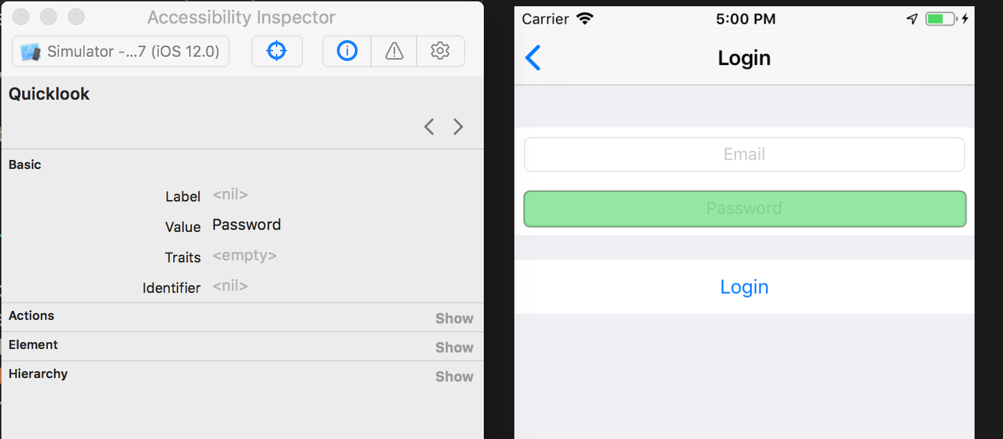
By hovering over different views in your app, you will see what iOS can read about each UI element. Imagine you can only see the things the inspector is telling you. What context is missing? Are there views which don't have any useful information in the inspector?
The Accessibility Inspector is your first line of defence against lousy accessibility practices. But it only tells you about each specific view. Sometimes the problem is more fundamental. How are the views arranged, does their hierarchy make sense, and are they easy to navigate? You can answer these questions with a stronger method of testing.
Voiceover
Simply use your app with screen reading turned on. Install the app on your device and go to Settings > General > Accessibility > VoiceOver and turn it on.
It might take a while to get used to VoiceOver, but it's the best way to know what your users are going through while using iOS and your app. It helps if you close your eyes.
Try to use your app with VoiceOver. Note down what you are confused by and what information is missing. This will give you an actionable list of things to fix, and turn accessibility from an abstract concept lying at the bottom of your priority list into a concrete chunk of work to be done.
Making Your App More Accessible
Now that you know what the problems are, how do you fix them? Thankfully, UIKit includes a few straightforward tools to make your app more accessible.
Accessibility Labels
One of the easiest ways to make your app accessible to more people is by using accessibility labels. Every UI element on screen has an attached accessibility label. While you might see a play button looking like this ▶️, a visually impaired person will hear "Play button". What they hear is the accessibility label of that view.
Accessibility labels are automatically generated for most things. A button titled "Play" will read as "Play button". But sometimes manual tuning is required in specific cases. For instance, your app may have a table view of songs, where each cell has its own play button. In this case, the accessibility label for the play button should be "Play Eleanor Rigby" instead of just "Play".
Doing this is so easy that I wonder why more people don't do this. If you're using storyboards, simply click on the view and take a look at the Identity inspector on the right-hand side. There's a whole section called Accessibility and inside of it a field for the Label. Edit this value to change what iOS says about that view.
If you're a fan of writing your UI in code, adding an accessibility label is a single line of code affair. Each UIView has a property called accessibilityLabel which you can set to a more appropriate text.
playButton.accessibilityLabel = "Play \(song.name)"
You also don't want automatically generated labels for images. If the button is an image, iOS might just read out "Button". Your users probably don't want to hear "Button. Button. Button." all the time! Always make sure to provide accessibility labels for visual graphics, like spinners or other fancy animated UI elements. iOS can read text, but it can't read the meaning of a graphic.
Writing a good label is an art of balancing descriptiveness with conciseness. Users will hear the labels a bunch of times, so make sure you're not annoying them with overly descriptive labels. Also, don't include words like "button" or "label" inside the accessibility labels, iOS already does this for you!
Being a Power User of the Accessibility API
Aside from accessibility labels, there are some other tools Apple gives you to make your app easy to use. While iOS provides a lot of things for you, if you're building custom controls there are a few things that you should do yourself.
One of those is the accessibility traits. Much like the label, this is a property on every view, and it tells the user additional information about what kind of thing that view is. Is it a button? Is it a text field? Can I interact with it?
Take a look at the different traits that are available to you. Make sure you set the appropriate traits if you're making a custom control.
There is also the issue of movement. Animations and UI changes are all visual cues to users telling them something has changed or grabbing their attention. Visually impaired users might not be able to benefit from visual cues, but there are ways to achieve the same goal.
For instance, a sighted user might open up the app, see a spinner, and after a while, the app populates with new content. A user using VoiceOver might only hear "Loading", and nothing else, even if the app loaded. You can tell iOS that you have a new layout to show by posting a UIAccessibility notification.
loadData { newData in
  self.data = newData
  tableView.reloadData()
  spinner.isHidden = true
  UIAccessibilityPostNotification(UIAccessibilityLayoutChangedNotification, nil)
}
Aside from big layout changes, you might be doing small changes, like showing a spinner on an image that's being uploaded. For these small changes, you can post an announcement notification.
UIAccessibilityPostNotification(
  UIAccessibilityAnnouncementNotification,
  "Uploading")
spinner.isHidden = false

upload(image) {
	spinner.isHidden = true
	UIAccessibilityPostNotification(
	  UIAccessibilityAnnouncementNotification,
     "Uploading completed")
}
There are lots of visual hints and animations we use to help sighted users navigate the app. There is no reason why visually impaired users couldn't benefit from the same cues. There are lots of other notifications you can post to the system, so keep them in mind.
Keeping Your Users in Mind While Working
As developers, we often don't consider it our job to evaluate how good a design is, but it is. People who don't understand programming can notice bugs. The same is true for design: you don't need to be a designer to see problems. Mistakes happen, it's your job to speak up when you notice them.
One of the biggest (or, more likely, smallest) problems is size. Some users might require a larger font size to read more easily. The first step is to support Dynamic Type. This will make sure the text in your app scales to what the user set in their settings. The second step is to make sure you're not using tiny fonts. You older self will be the first one to thank you.
Also be aware of the size of your touch targets. While it can be hard for people with disabilities to hit those small buttons, all users get frustrated by missed taps. Apple recommends a size of at least 44x44 pt, and I would bump that up even more. Remember that touch targets can be larger than the button's image or text.
This is one of the reasons it's essential to test on your device with your meaty fingers. A simulator with a mouse and keyboard is not enough!
Visual impairment comes in many shapes and forms. Some people can see things as detailed as everyone but have trouble noticing colors. This is why you should make sure there is ample contrast in your UI. Always make sure the text is clearly visible on your UI's background, and that buttons stand out from their surroundings. Make sure your app is usable even if someone is lowering that brightness slider!
Empathy is Key
The summary of all of these tips is that you should always have your users in mind. It's easy to get involved in office politics, deadlines or budgets, but the bottom line is the app is for your users. Make sure you are trying to put yourself in their shoes, and listen to their needs. Once you do that, most of these tips become common sense. And for the things that aren't obvious, make sure you open yourself up to feedback from your users.
I have never met someone who regrets making their app easier to use for people that need it, and I doubt you will.